January 16, 2026
Welcome To Waufl Academy – Your Shortcut To Real-World Marketing Mastery
This isn’t a theory textbook—every lesson here comes from campaigns that actually made money.

They made plain water cool by putting it in beer cans and selling rebellion.

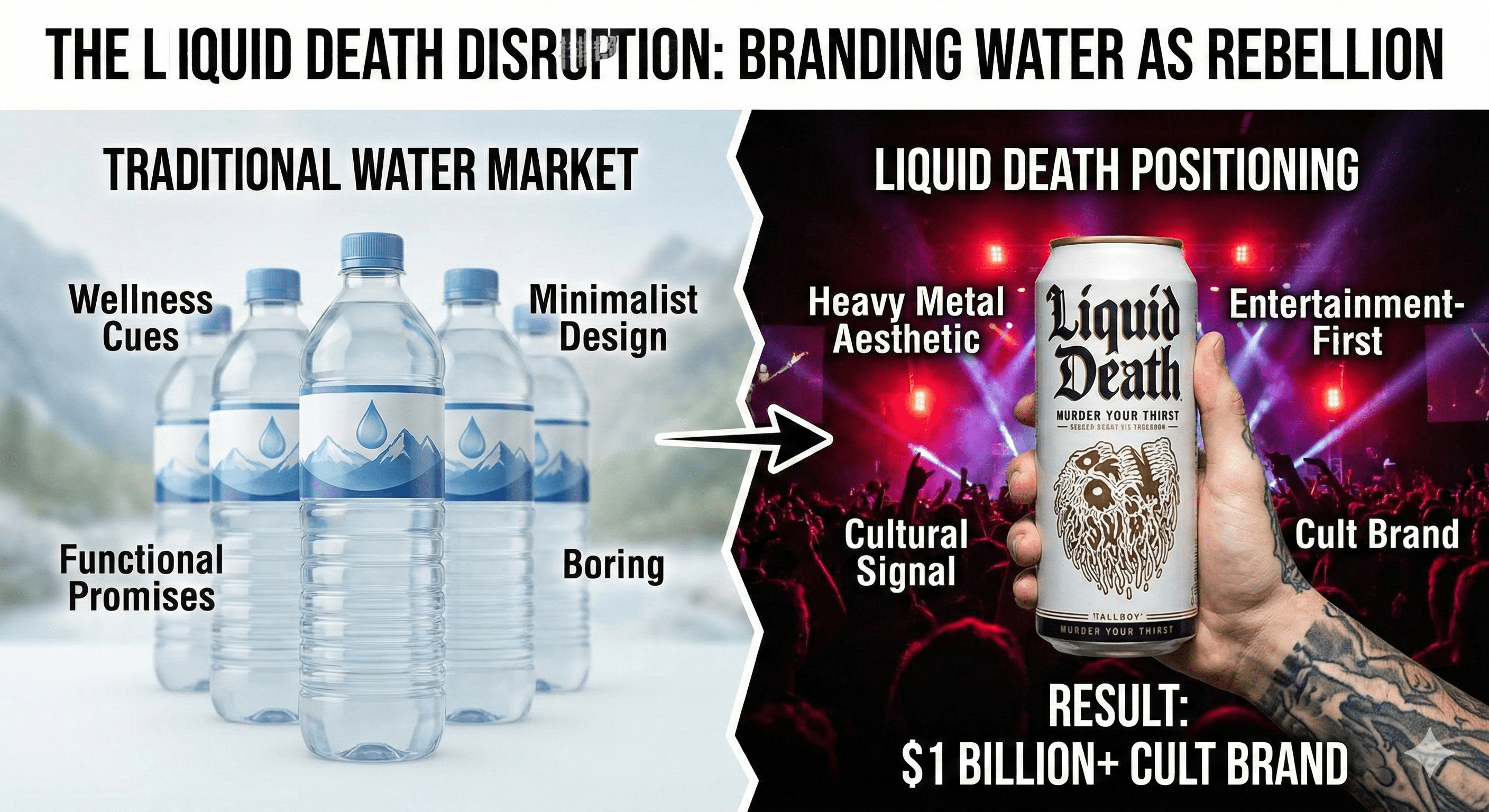
Liquid Death took one of the most boring products on the planet—still water—and turned it into a $1 billion–plus cult brand by treating it like a punk rock energy drink instead of a “healthy lifestyle” commodity. Founded in 2017–2018 by former creative director Mike Cessario, the company packages mountain water in tallboy aluminum cans, covers them in skulls and metal-inspired art, and sells the idea of “Murder Your Thirst” and “Death to Plastic” rather than another wellness promise. In a category flooded with minimalist bottles and nature imagery, Liquid Death built a business with hundreds of millions in annual sales—around $263 million in U.S. retail sales in 2023 alone—off a product the founder openly admits is not functionally better than other premium waters. The advantage comes from radical positioning, entertainment-led marketing, and using packaging as a cultural signal.
The bottled water and non-alcoholic beverage markets were already saturated when Liquid Death arrived. Most brands leaned on similar cues: blue-and-white labels, mountains, droplets, purity claims, and light wellness language. To younger consumers, especially millennials and Gen Z, this made nearly every bottle interchangeable; they knew it was “just water” with different logos, and many were skeptical of the environmental impact of disposable plastic.
At the same time, “better-for-you” drinkers were often culturally stuck between two worlds:
Bars, concerts, and parties made this tension obvious: ordering bottled water in that environment often felt uncool compared to holding a beer or energy drink. Meanwhile, plastic waste was a mounting concern, and aluminum cans were significantly more recyclable—about 73% recycled content versus much lower rates for plastic bottles—offering a genuine environmental angle.
Liquid Death stepped into this context asking a simple but provocative question: What if water looked and behaved like the most rebellious drink in the room, without the downsides?
The core tactic behind Liquid Death is extreme brand positioning and packaging-driven differentiation. Instead of competing on purity, source story, or electrolyte blend, the brand competes on identity and entertainment.
Key elements of this tactic:
Founder Mike Cessario has been explicit that the water itself does not taste meaningfully different from other premium options; the brand’s entire moat is storytelling, aesthetic, and cultural fit. This is a classic case of using positioning strategy to create perceived uniqueness in a commodity category.
The driving insight is that a big segment of consumers wants to be healthy without feeling like they’re joining a wellness cult. They do not want to hold a dainty plastic bottle at a punk show or metal concert, but they also do not necessarily want to drink beer or sugary sodas all night. They want something that:
Packaging and brand story are perfect tools to solve this identity tension. As several case studies note, Liquid Death’s tallboy can instantly signals “this brand belongs at the party” and lets consumers keep the social performance of drinking something edgy, even if it is just water. The can is a permission slip: “You can be the sober, health-conscious one, but your drink still looks cooler than everyone else’s.”
Another key insight: people hate ads but love entertainment. Cessario’s creative background led him to treat marketing as comedy, stunts, and weird content that audiences would choose to watch. Instead of pre-roll spots pleading for attention, Liquid Death makes mockumentaries, fake horror trailers, and wild collaborations (like a skateboard painted with Tony Hawk’s actual blood) that people share because they are bizarre and funny—not because they care about water.
Liquid Death’s execution ties these insights into a tight system across product, channels, and stunts.
This design ensures the can is instantly recognizable on shelves, in photos, and in the hands of fans. It also means that when someone holds a Liquid Death at a show or bar, they are signaling culture and humor, not just hydration.
Liquid Death’s growth is rooted in digital content that acts more like internet comedy than traditional beverage advertising:
These tactics embody the idea that people share jokes, not category claims. Every piece of marketing is designed to be inherently shareable, with the product riding along.
Rather than focusing on classic wellness influencers, Liquid Death leans into comedians, musicians, skaters, and creators whose audiences appreciate irreverence. The brand:
This approach aligns the brand with people who already embody its attitude, letting them extend the story into their own communities.
Liquid Death started with direct-to-consumer online sales and selected retail placements, then expanded aggressively as demand grew:
Distribution followed demand and brand heat, not the other way around. Retailers wanted the brand precisely because it drew attention to the shelf.
While the edgy brand is the main hook, Liquid Death backs up its “death to plastic” positioning with a sustainability angle:
This environmental stance adds a serious layer under the jokes. Consumers can feel that they are making a slightly better choice for the planet without giving up their desired identity.
What started as what many investors considered a “dumb idea” (canned water with a death metal brand) has become one of the fastest-growing beverage brands in the U.S.:
Beyond numbers, Liquid Death has become a frequent reference in marketing and branding conversations as an example of how far positioning and creativity can take a commodity product.
For marketing students, the value of the Liquid Death case lies in why this worked, not just the shock factor.
Liquid Death explicitly admits its water is not functionally superior; the differentiation is entirely in brand and meaning. Instead of focusing on attributes (pH, electrolytes), it defines who the brand is for: people who love edgy, irreverent culture but also care about health and the planet.
Transferable principle: In commoditized markets, brand positioning around identity—who the product lets someone be—is often more powerful than minor functional claims. Ask: “Who does my customer want to feel like when they use this?” not just “What does this do?”
The tallboy can is not just a container; it is a prop that tells a story and fits visually into specific contexts (concerts, parties, content). It instantly signals rebellion and sets the brand apart at shelf glance and on social.
Transferable principle: Treat packaging as a media asset that communicates your position in one second from across a room. If you swapped your logo with a competitor’s, would anyone notice? If yes, you have distinctive assets; if no, you have a problem.
Liquid Death’s campaigns are designed to be entertaining on their own, which turns them into shareable content instead of intrusive ads. Humor, absurdity, and narrative make people watch voluntarily.
Transferable principle: Especially for younger audiences, marketing needs to earn attention. Think like an entertainment studio: what would make someone watch, even if they do not care about the category yet?
The brand does not lead with sanctimonious environmental messaging, but its “Death to Plastic” line and aluminum choice give consumers a values-based reason to justify their preference.
Transferable principle: Values and sustainability can be powerful differentiators, but they often work best when woven into a compelling story, not presented as moral lectures.
Traditional water marketing rules—clean visuals, gentle language, wellness-first messaging—are all inverted. Liquid Death uses horror, punk, and dark comedy while still being a non-alcoholic, zero-sugar product.
Transferable principle: In crowded categories, systematically list the category’s “visual and verbal rules,” then explore what happens if you flip them. This is especially helpful for “boring” industries: industrial tools, SaaS, insurance, etc.
To turn Liquid Death into practical study material:
The overarching marketing principle: You can build outsized brand and business value in a commodity category by owning a sharply defined identity and telling a bold, entertainment-driven story that no competitor can credibly imitate.[nogood]
.png)