August 29, 2025
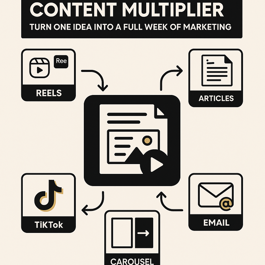
Content Multiplier: How to Repurpose One Piece of Content into a Full Week of Marketing
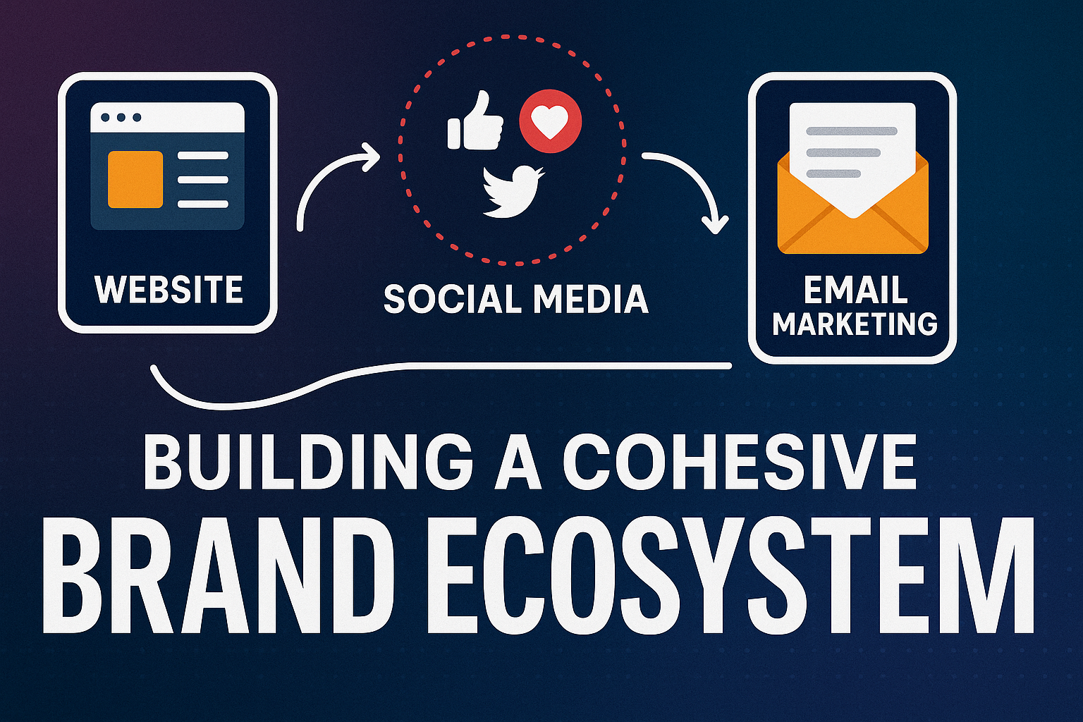
This framework is the difference between simply posting content and building a genuine, thriving brand ecosystem.

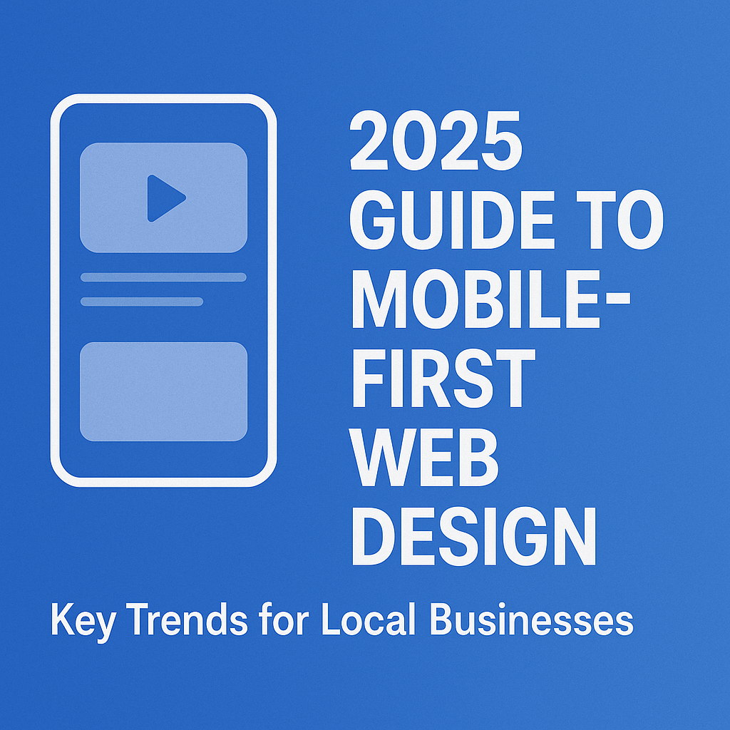
We start by designing for the smallest screen, focusing on the most essential content and functionalities. The result is a clean, streamlined, and lightning-fast mobile site.

In 2025, the digital landscape for local businesses has fundamentally shifted. For decades, the desktop website was king, with the mobile version often treated as a secondary, smaller version of the main site. That era is over. With over 60% of all web traffic coming from mobile devices, and a significant portion of local searches happening "on the go," your website’s performance on a smartphone is no longer an afterthought—it's the very foundation of your online presence.
This isn't just about making your site "mobile-friendly." It's about a complete mindset shift to mobile-first design. This strategy prioritizes the mobile experience from the very beginning, ensuring your website is fast, intuitive, and expertly tailored for the thumb-scrolling, on-the-go user. For local businesses, from the neighborhood bakery to the family-owned gym in Palatine, Illinois, embracing a mobile-first approach is the single most effective way to attract new customers, build credibility, and drive real-world traffic.
If your website isn't optimized for a mobile audience, you’re not just losing traffic—you’re losing business to competitors who are.
The traditional approach to web design was "desktop-first." You would build a full-featured website for a large screen and then adapt or scale down the content to fit smaller devices. This often resulted in slow-loading pages, cluttered layouts, and frustrating user experiences on mobile.
Mobile-first design flips this process. We start by designing for the smallest screen, focusing on the most essential content and functionalities. The result is a clean, streamlined, and lightning-fast mobile site. From there, we add more complex features and design elements to progressively enhance the experience for larger screens. This ensures that the core of your website—your value proposition, contact information, and key services—is always front and center, no matter the device.
To thrive in today's digital environment, your mobile-first design strategy must incorporate these key trends:
Google's Core Web Vitals are a set of metrics that measure a website's user experience, and in 2025, they are more critical than ever for SEO. For local businesses, a passing score on these metrics is essential for ranking highly in local search results.
The ROI is simple: A faster site leads to lower bounce rates and higher conversion rates. Studies show that a two-second delay in mobile load time can increase bounce rates by over 32%. A fast site doesn't just rank higher; it keeps customers on your page.
The way users interact with a mobile device is fundamentally different from a desktop. They use their thumbs, their attention spans are shorter, and they are often multitasking. Your mobile design must cater to this reality.
Local businesses are searched for by people with a specific need and a clear location. Your mobile-first website needs to be a local SEO powerhouse.
With the rise of TikTok, Instagram Reels, and YouTube Shorts, short-form video is dominating online attention. Integrating this trend into your mobile website is a game-changer for engagement.
A mobile-first website provides the ideal canvas for these videos, ensuring they load quickly and play seamlessly, engaging your audience on their preferred device.
The shift to a mobile-first strategy isn't just about keeping up with trends; it’s about a direct, measurable impact on your business growth:
For small-to-mid-sized businesses, this is the differentiator that helps you not just compete with, but often surpass, larger competitors with outdated digital strategies.
In 2025, your local business can't afford to be an afterthought on mobile. Your website needs to be your most powerful tool for attracting, engaging, and converting customers who are searching on their smartphones.
At Waufl Media, we specialize in building modern, mobile-first websites that are not only beautiful but also strategically designed to grow your business. We combine expert UX design with our unique storytelling approach, high-end video production, and localized SEO to create a digital presence that helps your brand stand out and thrive.
Ready to transform your website into a mobile-first powerhouse? Let's talk about building a site that works for you, wherever your customers may be.
.png)